


Form and function typically drive new building designs, and rightfully so. Massing, building layout and functionality have a huge impact on a project’s success. Once these key components are determined, architects can take buildings to another level by designing with interesting cladding and colors. A building’s context often informs color selections, so the region, location, and target market must all be assessed in order to determine the most effective design solution. In the end, color and context have the potential to set an immediate, striking tone for new buildings that will leave a lasting impression.
BOLD COLORS
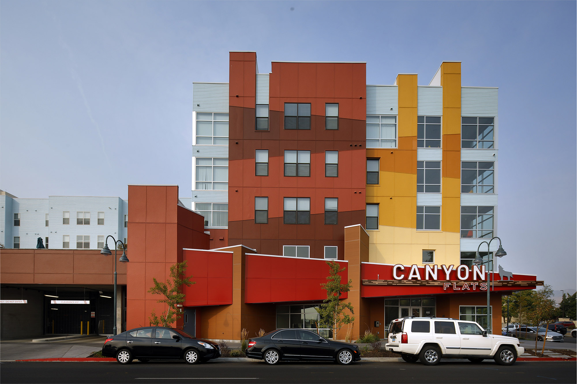

In an established community of primarily tan and earth-toned buildings, Canyon Flats was designed to garner attention within the context of the neighborhood. The design team opted for relatively simple overall massing, then introduced some major pops of color that really stand out against the building’s gray background. These warm, bold colors wrapping the exterior create a very dynamic streetscape.
Because of its tight, infill parcel, most of the exterior footprint was kept flat so it could extend to the lot perimeter in order to squeeze in as much square footage as possible. Adding color in a unique pattern enhanced movement on the façade. In addition, the recessed rooftop patios help scale down the building and create more visual interest. Effective use of color generates amazing “wow” factor that helps this design stand out among other buildings in the city.
LESS IS MORE


Minimalistic design styles are trending in popularity. This type of architecture often uses lighter, muted tones, and the lack of color actually helps designers emphasize the prevailing architectural elements on the building. This is the case for Sawyer, a multifamily community located in Los Angeles, CA, and designed by our LA office.
The exterior streetscape focuses on clean lines highlighted by minimal color for a very modern feel. For context, the building does employ sections of red brick at the base and in some vertical bands. This brick is intended to reflect the design of adjacent buildings, including a historic church, so the brick provides a somewhat traditional base for an ultra-modern building above. The rest of the building is highlighted by black metal recessed and overhang balconies with tons of glass. Even the interior amenity spaces feature clean, modern design that mirrors the building’s exterior tone. In terms of color, less is more for this successful multifamily design.

DIMENSION
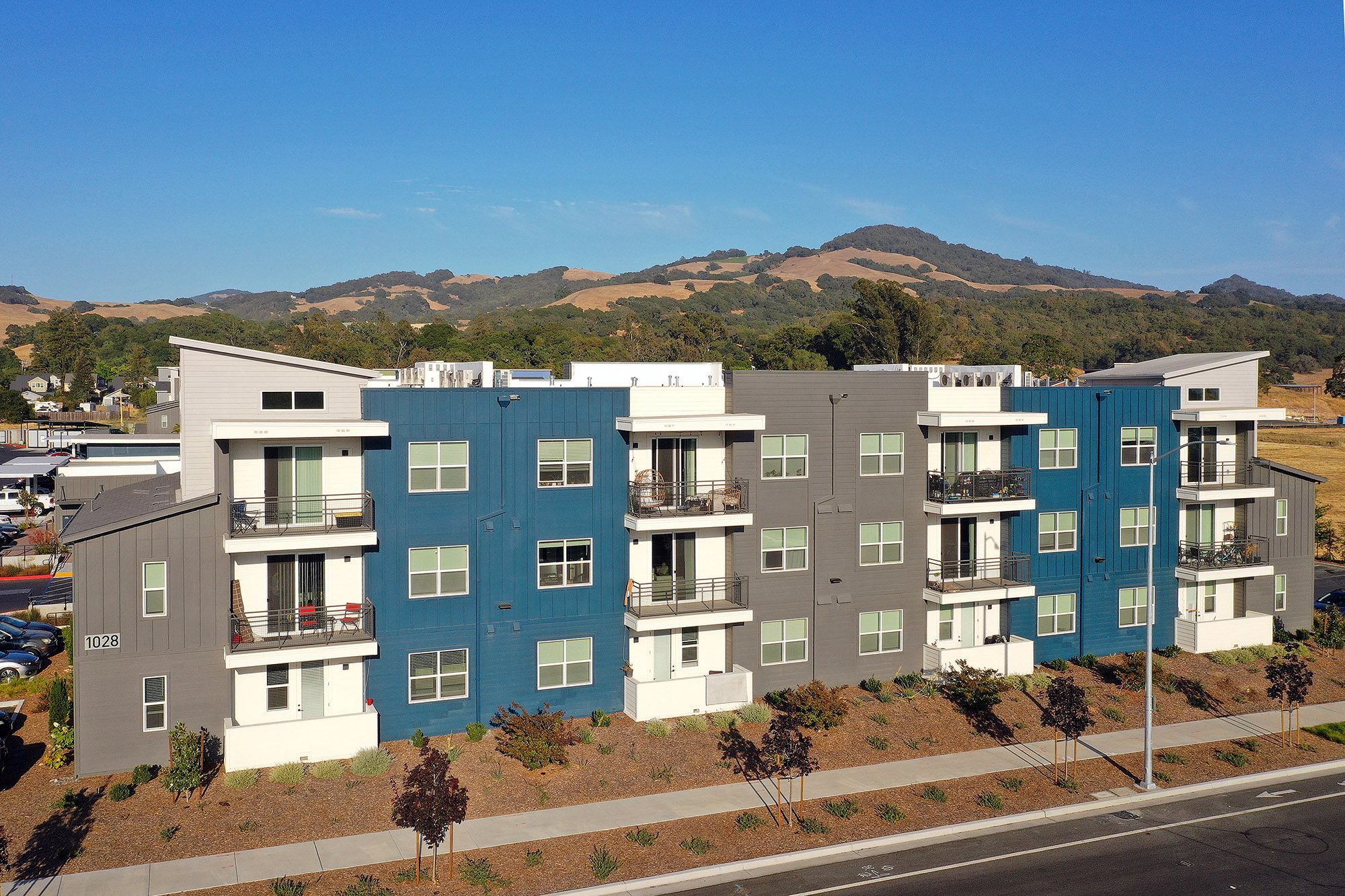 38° North is the first design of its kind in Santa Rosa, CA. The architectural focus was to create a contemporary community marked by clean lines and bold bands of contrasting color. The buildings feature vertical and horizontal siding, overhang balconies and angled roof concepts that effectively balance the design. And while the massing definitely makes a statement, the primary feature that makes this design work is its color. The mix of blue and gray adds a distinct sense of dimension that would be impossible to achieve with a single, more neutral base color. This deliberate use of color creates a memorable sense of arrival for the community, standing out as truly unique among the competition.
The concept of color and its effect on architecture is different for each product type, building shape and community context. But there’s no doubt that color has a major impact on every architectural design. Whether going bold, staying clean and minimal or doing a little bit of both, considering color from the earliest stage of design will help create an incredible project.

These projects were featured in Volume 11 of our inspire magazine. Check it out here!


